Are Your Website's Broken Windows Blocking Sales?
Your website is your online storefront. How's it look to your customers?
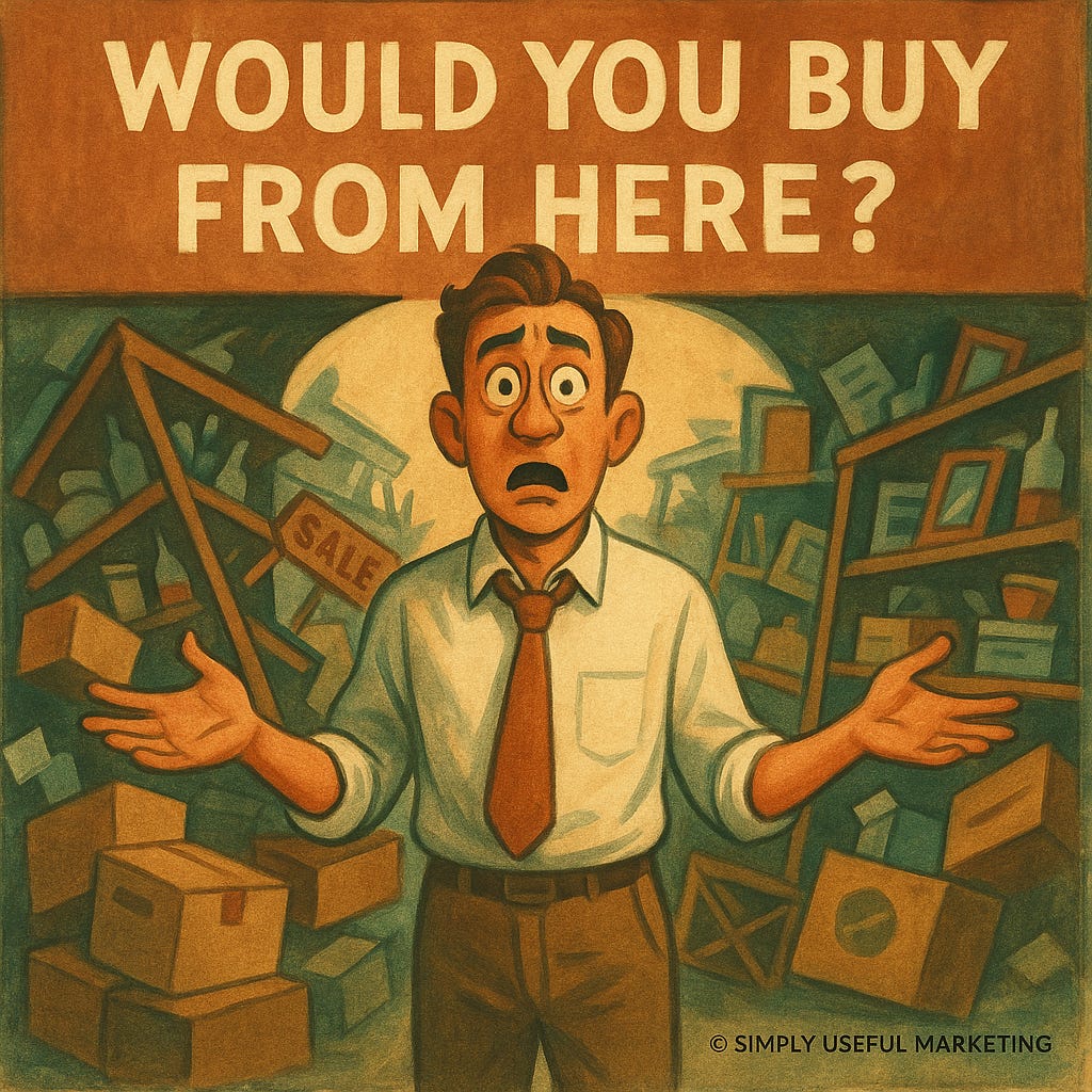
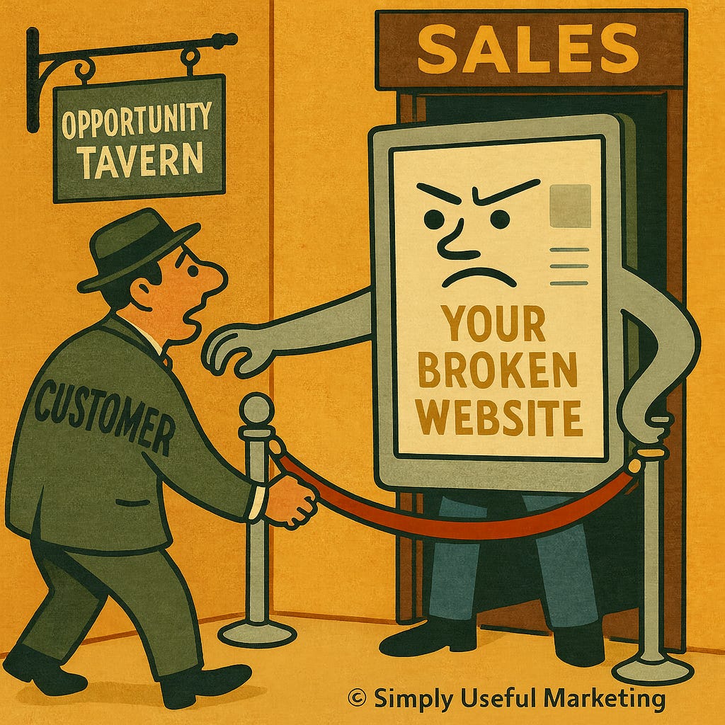
Would you go into a store with busted windows and a doorknob that needs to be jiggled to open?
Your website works the same way.
If visitors can’t immediately find what they’re looking for, they don’t think, “Oh, what an interesting design.”
They think, “Nope. Next.”
Online, broken windows kill trust faster than anything else. (FYI, your Substack newsletter, unless you also have a website, IS your website and storefront.)
And in 2025, your website is the first salesperson 70–90% of buyers ever meet. Most B2B buyers now complete the majority of their research — sometimes all of it — before ever speaking to anyone on your team.
If your site is confusing, outdated, slow, or unclear, buyers won’t complain.
They’ll just vanish.
Would You Buy From You?
Do a quick walk-through of your site as if you’re a skeptical customer — because that’s what people are now.
Ask yourself:
Do I understand what this company actually does within five seconds?
Is the site about me (the customer) or is it an autobiography?
Does the copy sound human, or like corporate MadLibs?
Does it load in under 3 seconds? (40% of visitors leave after three.)
Is it readable on mobile without a microscope? (~60% of browsing is mobile.)
Is the navigation obvious?
Are the basics answered — pricing, process, outcomes?
(57% of buyers never talk to sales before shortlisting vendors.)
If the experience feels like work, the customer leaves. No drama. No feedback.
Just silence.
Don’t Make Me Think
I used to be a “throw it all up” website guy. After reading Don’t Make Me Think years ago, I realized:
I was wrong.
You can have everything on your website — but not on one page, and not without thought.
Steve Krug’s classic book was right years ago, and it’s even more right today:
Confusion = friction = abandonment.
People don’t puzzle through websites. They bounce.
When we are scrolling, we, as a species, have the attention span of a toddler holding a juice box, eating a cheese doodle, playing with blocks, and watching a cartoon while trying to pet the cat.
If your buyer has to think — or worse, guess — about what to click next, you’ve lost their attention and any chance of a sale.
You don’t need to write a novel on every page. Clarity isn’t minimalism; it’s intention.
A website that makes people think too much is a website that loses business.
The Basics Still Matter (More Than Ever)
1. Speed
Speed has always been important, but now it’s essential:
40% of people abandon after 3 seconds
Each extra second can drop conversions by up to 20%
Slow = gone.
2. Mobile-Friendly
“B2B buyers aren’t on mobile” died a long time ago.
60%+ of browsing is mobile
LinkedIn, email, Slack, research — all mobile
Google rewards mobile-first sites
If your layout breaks, trust breaks.
3. Core Web Vitals
Google doesn’t care about your brand story. It cares about:
load speed
visual stability
mobile usability
content clarity
Get these right and you immediately outperform a big chunk of your competitors.
4. Accessibility
Accessibility = trust, reach, and in some cases, compliance.
Alt text. Contrast. Logical reading order.
If your site isn’t accessible, you’re literally shutting out customers.
5. Security
If your site says “Not secure,” visitors read:
“This company is careless.”
Even if you don’t sell online, HTTPS is non-negotiable.
And Now… There’s AI
Google’s AI Overviews (rolled out globally in 2024–2025) pull from:
clear structure
schema markup
helpful, human answers
trustworthy, fast-loading pages
If your site is a digital junkyard of broken windows, AI will ignore it entirely.
If your site is clean, useful, and structured, AI may feature your content — the new SEO jackpot.
What This Has To Do With Marketing
Everything.
Your website is the foundation under:
inbound
outbound
ads
social
email
referrals
partnerships
even AI discovery
If the foundation is weak, all routes to success collapse.
A great website:
increases conversions
increases time on site
amplifies your newsletter
strengthens your social content
boosts AI visibility
reduces friction
builds trust
raises the odds someone buys
A bad website quietly strangles opportunity in the background.
The worst part? You’ll never know who you lost.
So… Are Your Windows Broken?
If the answer is “maybe,” the answer is “yes.”
The good news: fixing this doesn’t require a rebrand or a 200-page redesign.
You need clarity, speed, and a website that helps people buy — not one that sends them scrambling for the back button.
If you’d like a fast, honest review of your site — no jargon, no BS — I can walk you through what works, what’s broken, and what should be fixed first.
Just reply. I’d love to help you repair those windows and wobbly doorknobs; bryant@simplyusefulmarketing.co.
Musical Interlude
Edited and formatted while listening to Johnny Cash’s American Recordings. One of my (MANY!) favorites is The Beast in Me.


Thanks, Mack. And that's exactly how I use mine, which colors how I see and use this place -- not interested in paid subs (though its there if someone wants to). Honestly not sure if this is the right spot for me.
But the Notes aspect is built in reach so that's nice. And I'd have to create another WordPress site and hosting and pay for it so why not here.
Most of my traffic is from my email list, though as Im more active on Notes and sharing on LinkedIn that's beginning to shift slightly.
As I start to push more, curious to see how numbers shake out (fingers crossed growth kicks in soon to find out!).
First, I agree with all of this. Especially your point that if you don't have a website, your Substack is your defacto website.
Having said that...how many views does the average Substack drive? I haven't seen anything definitive (maybe you have), but I am under the impression that most people will view my content via Notes rather than go to my Substack.
I know some people do, I just don't think it's a significant percentage. Still a good idea to have good UX and structure on your Substack, but...